


Colour drenching might be a highly contemporary interior design trend but it’s been around since at least the days of Claude Monet. Effect Magazine decodes the phenomenon and speaks to interior designers and paint companies to find how to use it most effectively.
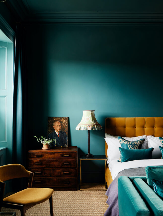
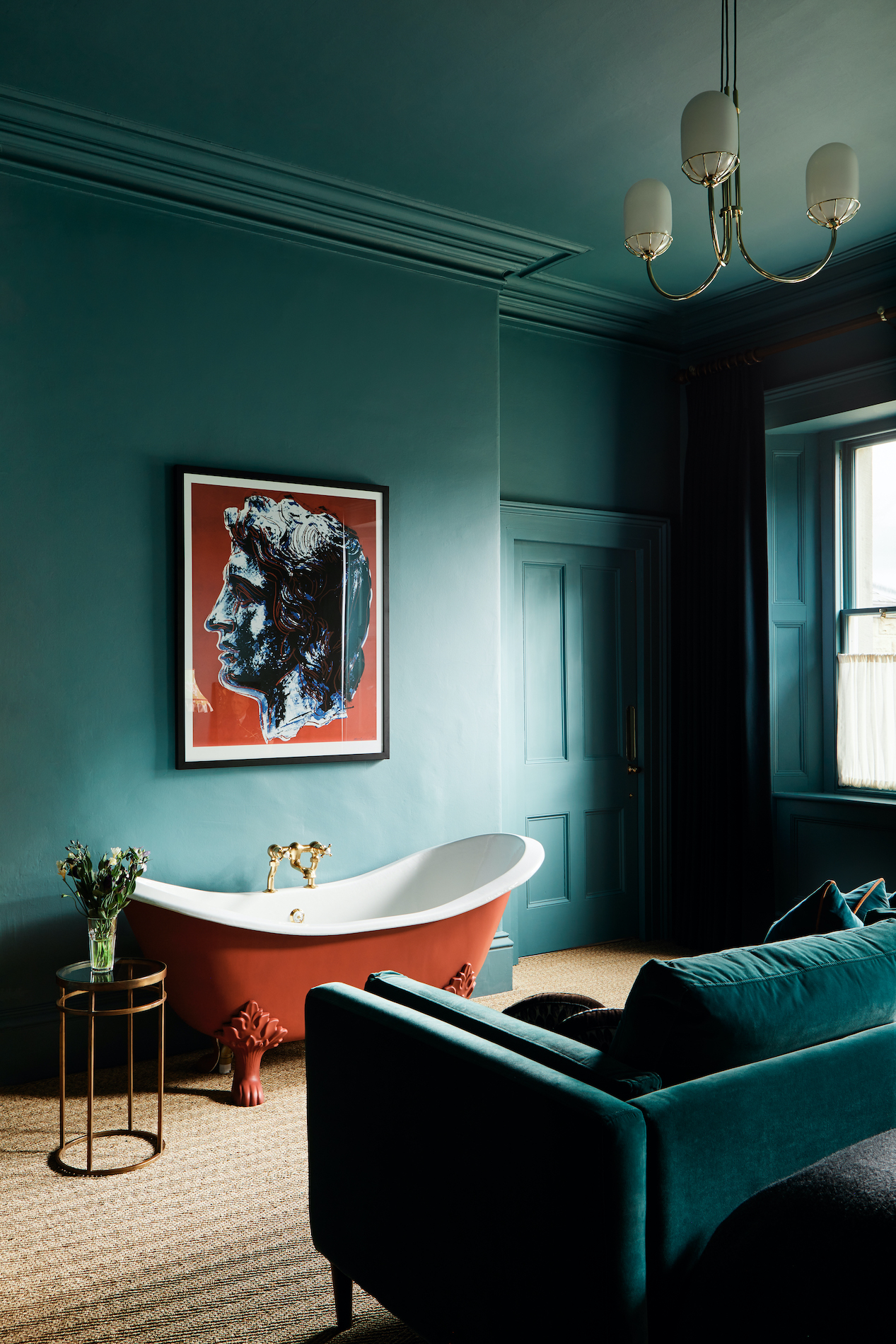
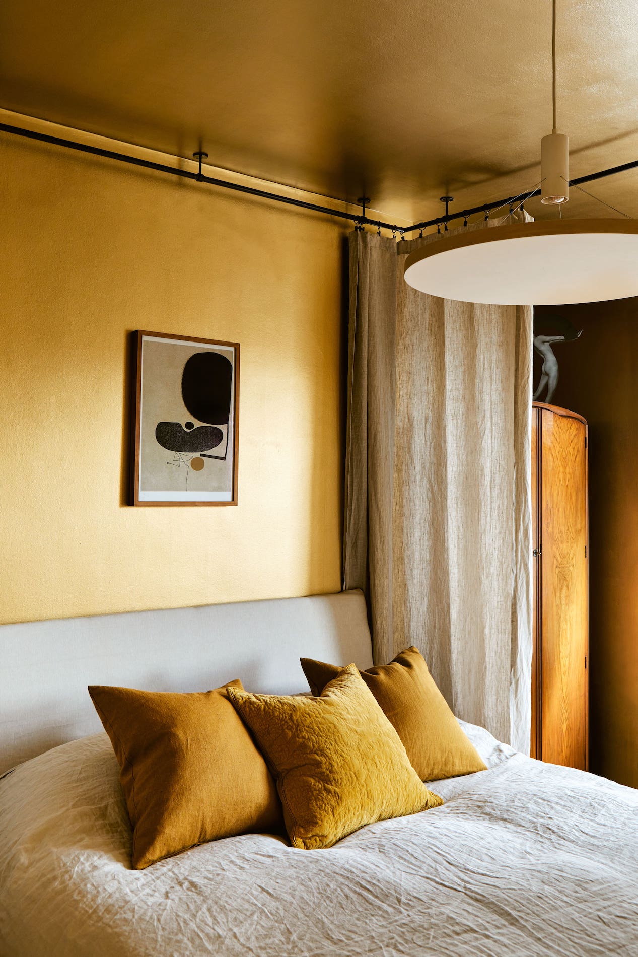
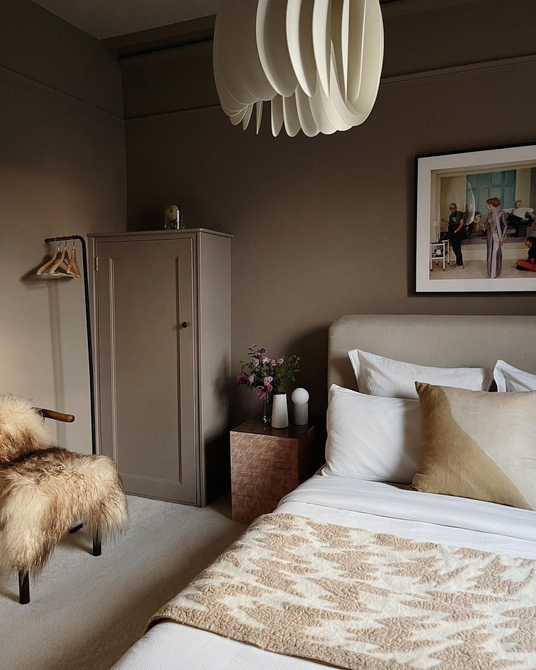
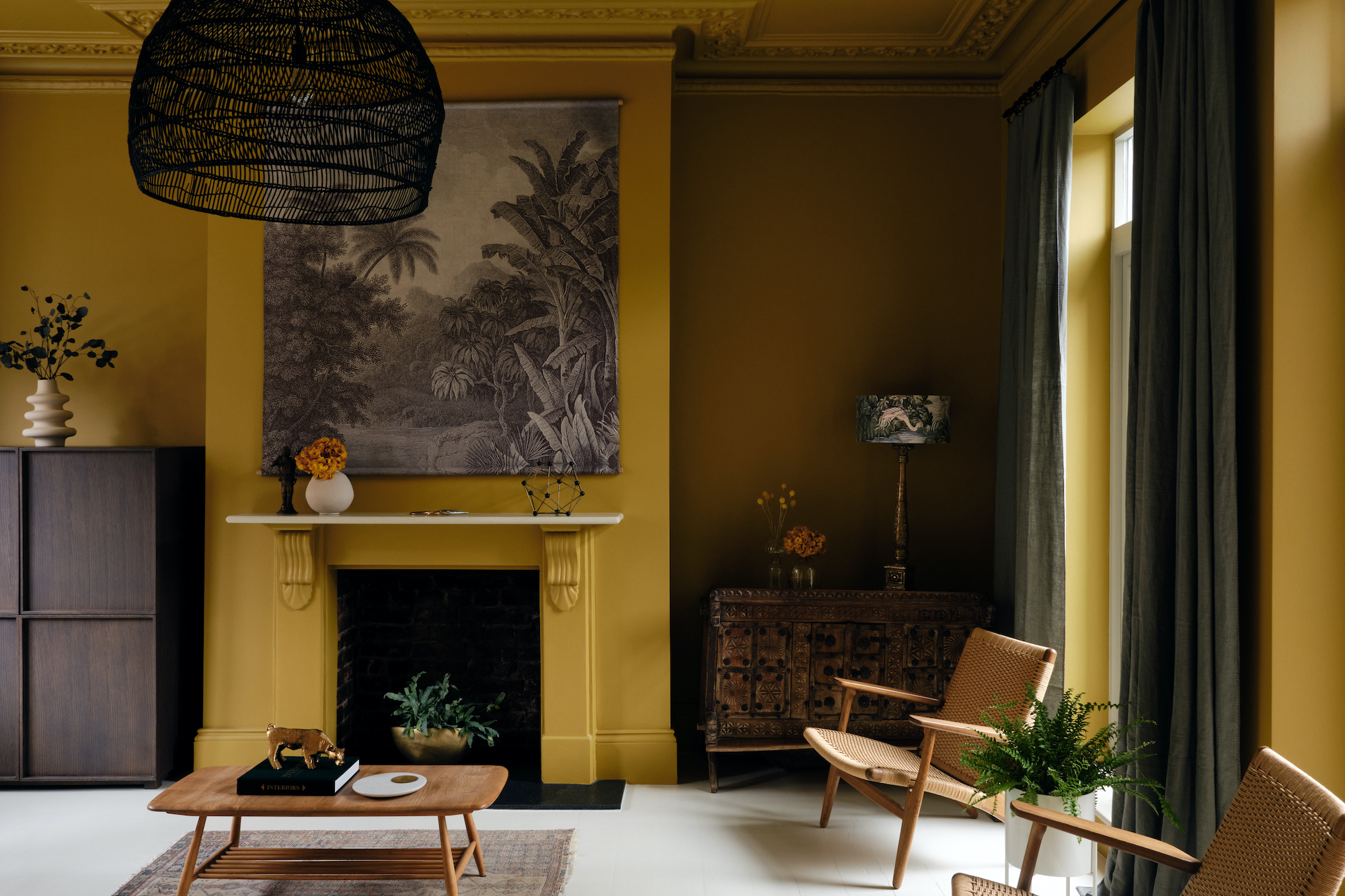
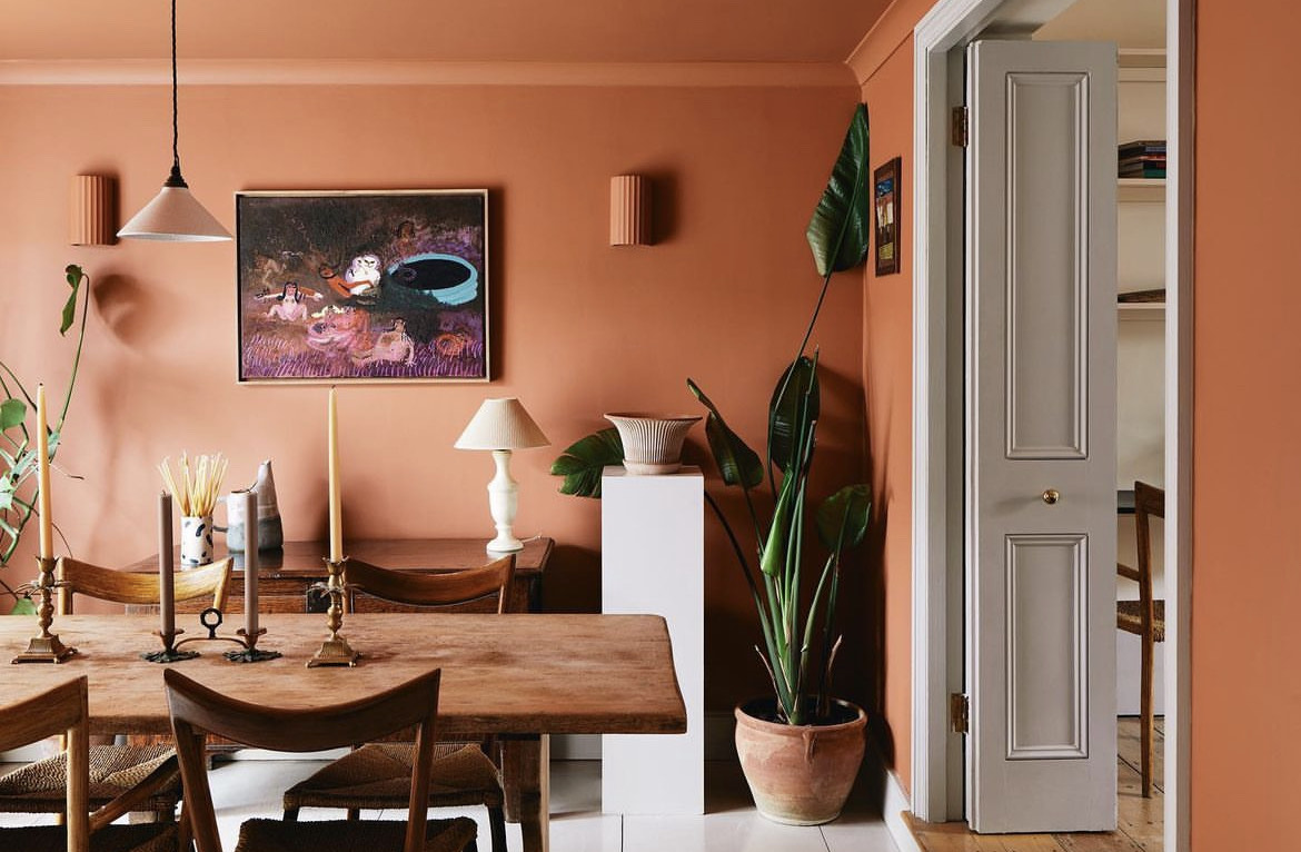
Colour drenching, a trend we predicted would make quite a splash in 2024, is indeed catching on fast, with many an interior designer espousing this pleasingly immersive look. Also dubbed a wraparound paint scheme, it involves painting entire rooms a single hue, with ceilings often treated as an additional wall. Colour drenching might sound full-on and overpowering, but it needn’t be oppressive and the atmosphere it creates varies enormously, ranging from the ultra-dramatic to the ethereal, depending on the chosen hue. A room entirely painted in sunshine yellow will glow gloriously, bouncing its luminosity all around a space. Conversely, a wispy pastel blue scheme can feel ethereal, creating a very different sensation, similar to imagining floating in a cloud.
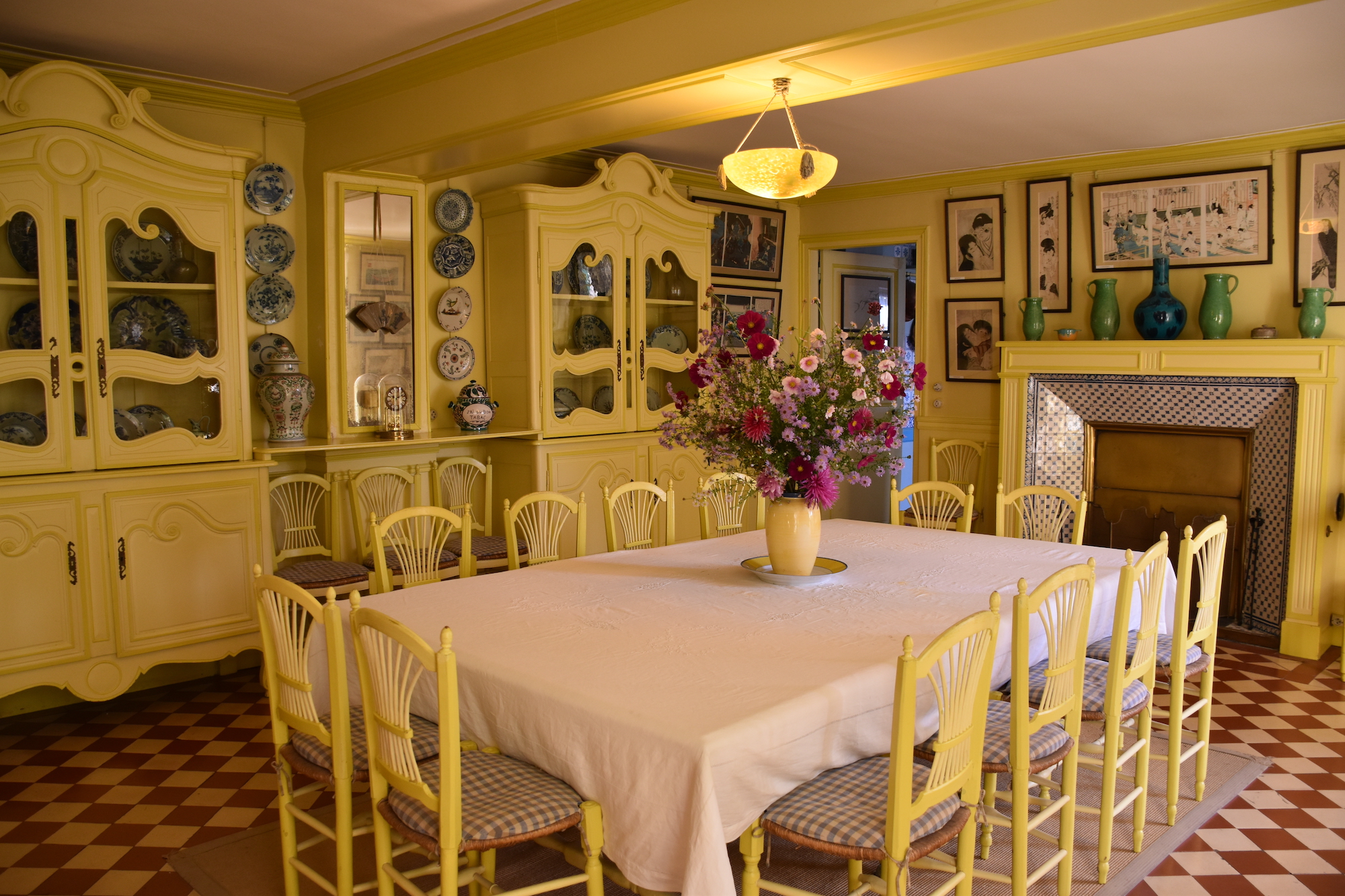
Being a relatively new interiors trend, it’s possible to overlook its historical precedents. A seminal example is artist Claude Monet’s home in Giverny, France, where he lived from 1883 to his death in 1926. One of its boldest interiors is its radiantly yellow dining room. Monet was inspired by his gardens and believed that it was important to surround himself with nature or a feeling of nature even when indoors, which is hardly surprising given that he was an Impressionist who loved painting en plein air.
Done well, colour drenching has the effect of making a space coherent and elegant.
Russell Whitehead, co-founder of London interior design practice 2LG Studio
The dining room creates the impression of sunlight drawn indoors and retained. The dining chairs were painted daffodil yellow too (not that the colour of furniture needs to match that of walls in a colour-drenched room, though in this room the chairs make the room glow even more).
Wraparound paint schemes partly appeal because they pull the look of a room together, helping to unify its various elements in an elegant, minimalist way. After all, a minimalist interior needn’t be all-white; it can simply be restricted to one shade. Dominic Mylands, CEO of paint brand Mylands, defines the style as follows: “Colour drenching in its purest sense is the application of one colour across all walls in a room, including the ceiling, doors, skirting boards, architraves and radiators. It’s increasingly popular with interior designers and our customers. Flooding an entire room with a single colour is unifying, decreasing visual noise.”
The look, which admittedly some might find severe, can be surprisingly nuanced, thanks to variations in finishes. Despite the homogeneous look of wraparound schemes, changes in daylight result in unpredictable, visually pleasing variations in a single shade.
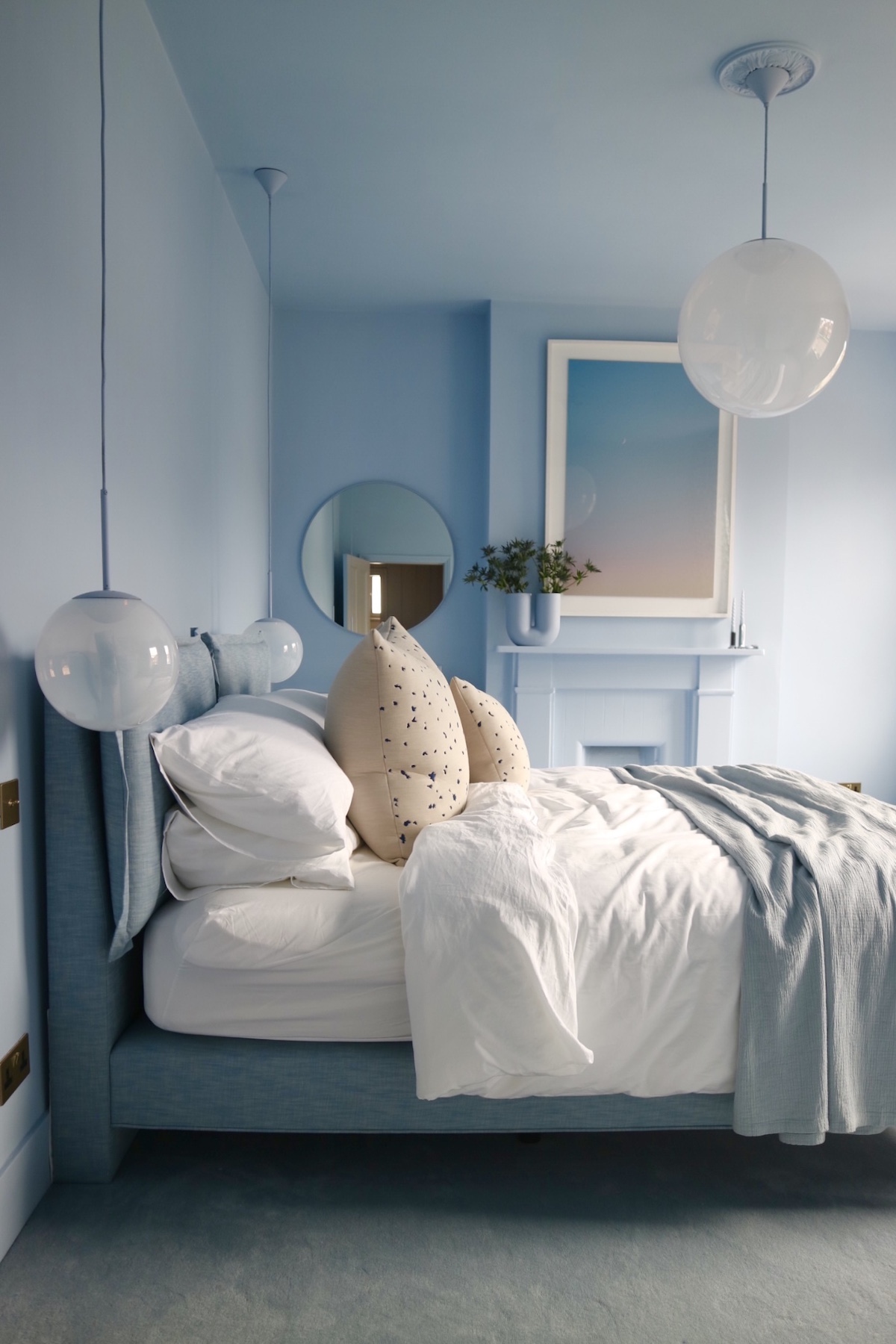
“Done well, colour drenching has the effect of making a space coherent and elegant,” says Russell Whitehead, co-founder of London interior design practice 2LG Studio. “Somewhat counterintuitively, a bold use of a single colour across walls, ceilings and perhaps even the floor can unify disparate, even imperfect elements in a space to unexpectedly calming effect.” Whitehead and his partner Jordan Cluroe painted their bedroom entirely a pale powder blue that feels serene and restful. “Colour-drenched rooms bathe you in a specific atmosphere,” says Whitehead. The duo advise using the approach sparingly, however: “It means that when you walk into a colour-drenched room from another space, the impact is greater.”
Russell and Cluroe see the trend as having an emotional force that should be embraced: “Choose colours that you have an emotional response to,” they counsel. “But it’s also advisable to take the tone down a notch when choosing a shade from a colour card as it will be amplified when it bounces on all walls and ceilings.”
This uncompromising look begs the question of whether it’s best for such spaces to be uncluttered, kitted out, perhaps, with understated furniture in comparatively neutral tones that won’t make the wraparound scheme feel overwhelming. “Our preference is for an uncluttered look,” avers Whitehead. “We call this joyful minimalism. It’s about a decisive use of colour. Minimal spaces needn’t be all-white anymore. But for us, nothing is more exciting than a space with conviction, so we always say you must ‘do you’ and do so to your fullest.”
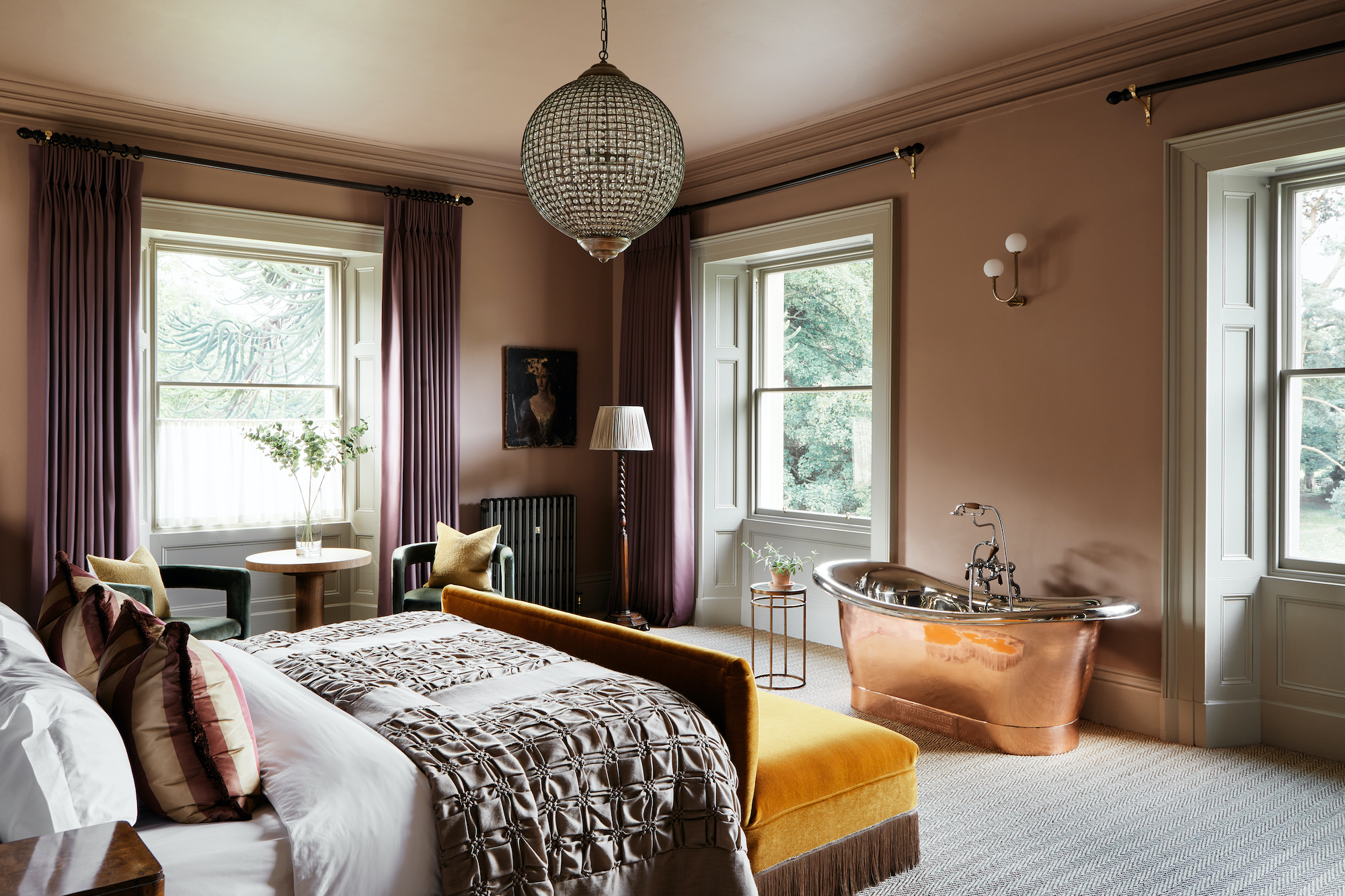
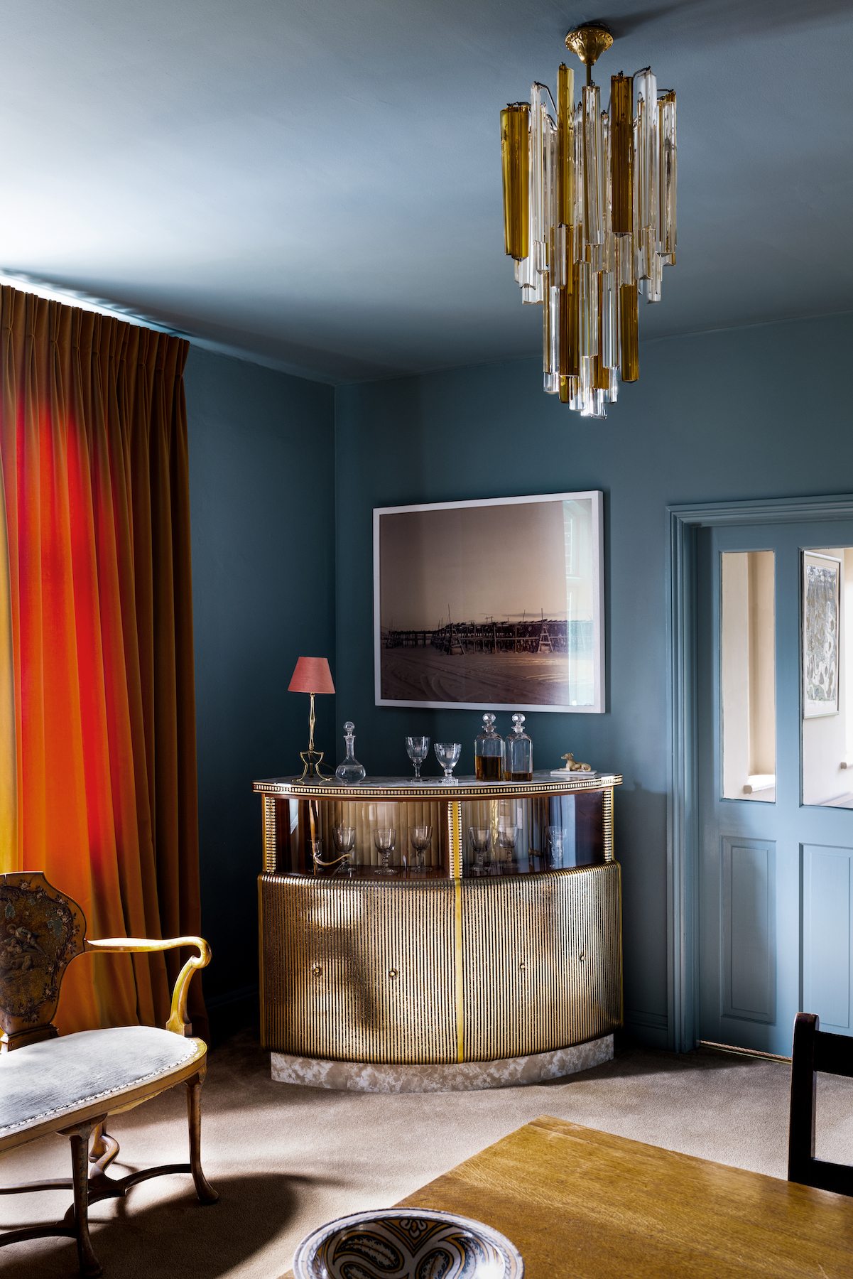
Perhaps paradoxically, a wraparound scheme needn’t feel oppressive or as if it’s closing in around you (although there’s a lot to be said for colour drenching that feels comforting and cocooning if the desired effect is cosiness). A good example of the different impact colour drenching can have can be seen in two rooms painted in Mylands hues. “The use of a light-toned colour such as FTT-001 Rich Gold, from our Film, Television and Theatre collection, enlarges and brightens a space, while a darker, richer shade like our paint colour, Burlington Arcade No 216, creates warmth and an inviting atmosphere, which works especially well in smaller rooms,” says Mylands.
“Drenching an entire room in one unifying colour can create the feeling of higher ceilings and, when using a lighter colour, the illusion of greater space,” opines Will Plowden, founder of homeware e-commerce site The Roost. “This approach can also draw attention to quirky, characterful features such as a sloping ceiling, while seamlessly blending them into the space for a contemporary look.” Yet, he adds, subtlety can be introduced with the use of contrasting finishes: “For an element of differentiation, combine an eggshell finish for woodwork and a flat matte one on walls.”
Rob Abrahams, co-founder and CEO of Coat Paints, which is stocked by The Roost, agrees that colour drenching makes rooms feel more spacious: “Painting skirting boards the same colour as walls blurs the lines between a room’s different elements, tricking the eye into perceiving a space as more expansive.”
“I love using the same colour on walls and ceilings as the eye reads the space differently – in a good way,” says Lucy Currell, founder of interior design practice, Studio Iro. “It avoids harshness of colour difference as the colour blends together, making you feel relaxed.”
Creating a pleasantly enveloping cosiness was uppermost in Currell’s mind when she chose a smoky blue – Farrow & Ball colour Oval Room Blue – to colour-drench a large hallway in a house in Norfolk. “The house was previously a pub, so the entrance hall is unusually big as it’s where the bar used to be. I wanted the space to feel cosy though rather than cavernous. I wanted to make a feature, too, of the huge ceiling. The blue is really soothing and makes you feel like you’re underwater.” This might sound an alarmingly claustrophobic prospect but colour drenching is more versatile than it might seem for such a punchy, full-on effect. It can create a multitude of moods and atmospheres, depending on a variety of factors, from the size of a room, the amount of daylight it receives and above all, the colour chosen.
Read more: Interiors | Trends | Living Rooms | Dining Rooms | Bathrooms | Design