


While often associated with youthfulness and innocence, pastels don’t just belong in a children’s bedroom. Handled correctly, here’s how they can be a sophisticated, stylish and timeless choice for any room in the house.
In interior design, just like high fashion, trends come and go. One day we’re reading about ‘cottagecore’, the next it might be matching furniture sets or bouclé, and don’t get us started on all-greige-everything. Ever-evolving, and with soft and calming nuances, pastels, however, have dipped in and out of popularity for centuries, and there’s good reason why they are currently undergoing a long-overdue rebirth. “Pastels are incredibly versatile colours, and their desaturated nature makes them perfect for those who want to introduce a pop of colour, but might feel apprehensive of choosing bolder or more vibrant hues,” Liv Wallers, co-founder of British interior design studio Yellow London tells Effect. “In particular, shades like lilacs or soft blues almost act like a neutral yet still add personality and character to a space in a way which a standard neutral or white might not.”
Defined by a palette that is soft, chalky and muted while boasting a heavy dose of white that awards them their high brightness value and low saturation, you could argue that pastels have never really gone out of style since they first became popular back in 18th-century France. “The art and fashion of that era started to naturally appear in the interiors and textiles, and pastels were a large part of the Rococo style,” explains LA-based interior designer Lonni Paul. The founder of Lonni Paul Design, her portfolio ranges from unique contemporary spaces to luxury private residences in Provence, Aspen, Bel Air, Beverly Hills and Saudi Arabia. “Think Sèvres porcelain and all things Marie Antoinette,” she adds.
Cycling in and out of vogue ever since, pastels were notably popular throughout the Art Deco era of the 1920s and 30s, and then again in the 1950s post-war context, when they were used to inspire optimism. They reappeared in the late 1980s with the advent of Memphis Design and, in 2016, Pantone even broke the tradition of naming a single colour of the year and instead championed ‘Rose Quartz’ and ‘Serenity’ as joint favourites. “When we’re living in a time of discord, often the public at large will retreat to a palette, particularly in the home, that makes them feel a little easier and lighter,” Leatrice Eiseman, executive director of the Pantone Color Institute said at the time.
Now, these so-called ‘retro colours’ are once more making their mark in the 21st century, displaying how pastels are a classic interior design choice that continue to evolve. “In the current climate we need relaxation at home more than ever,” adds Paul. “Our homes need to feel like a calming sanctuary to escape the outside noise, and pastels have a way to introduce this soothing feel to a space, which I think plays a big part in their popularity today.”
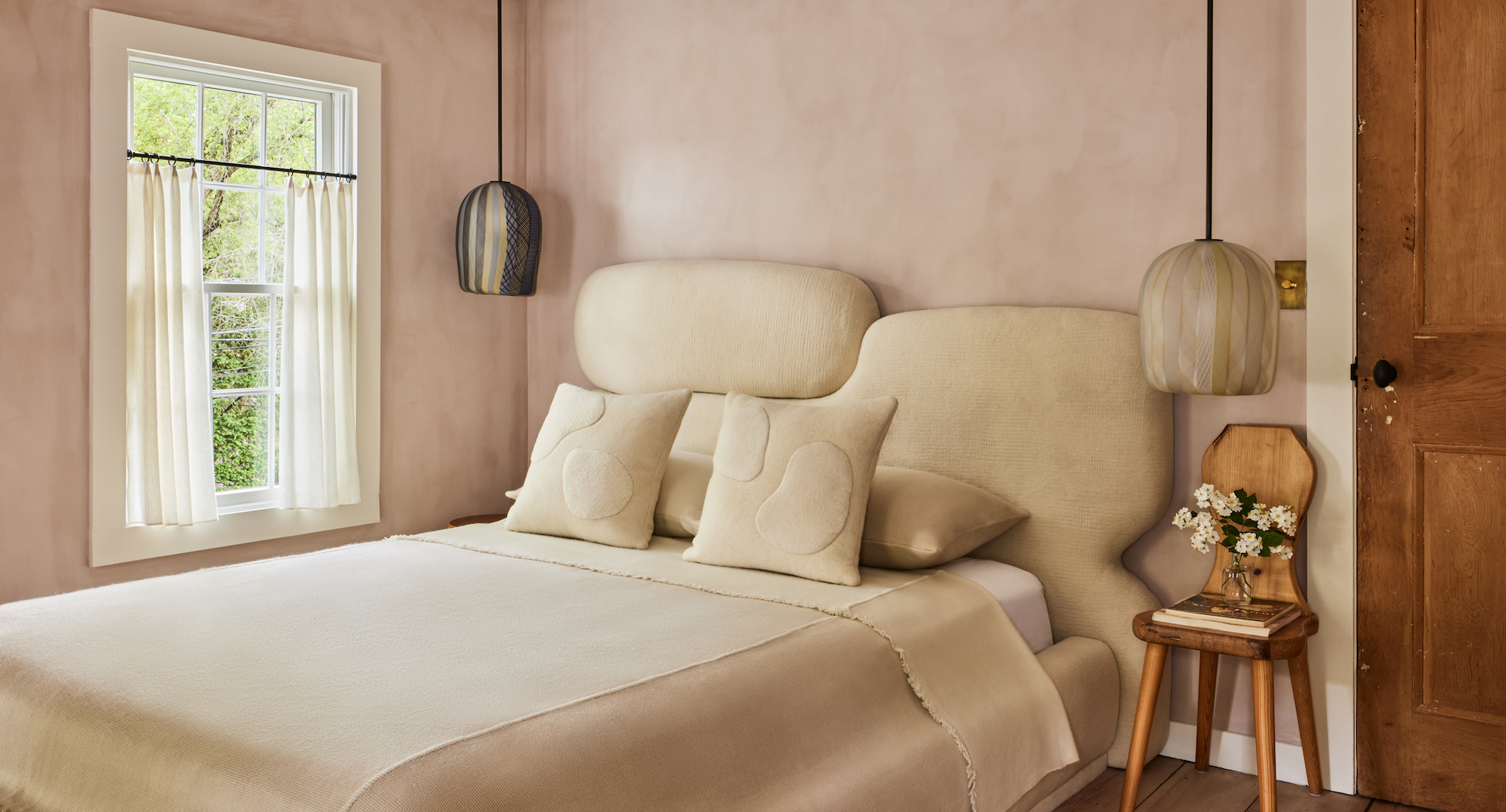
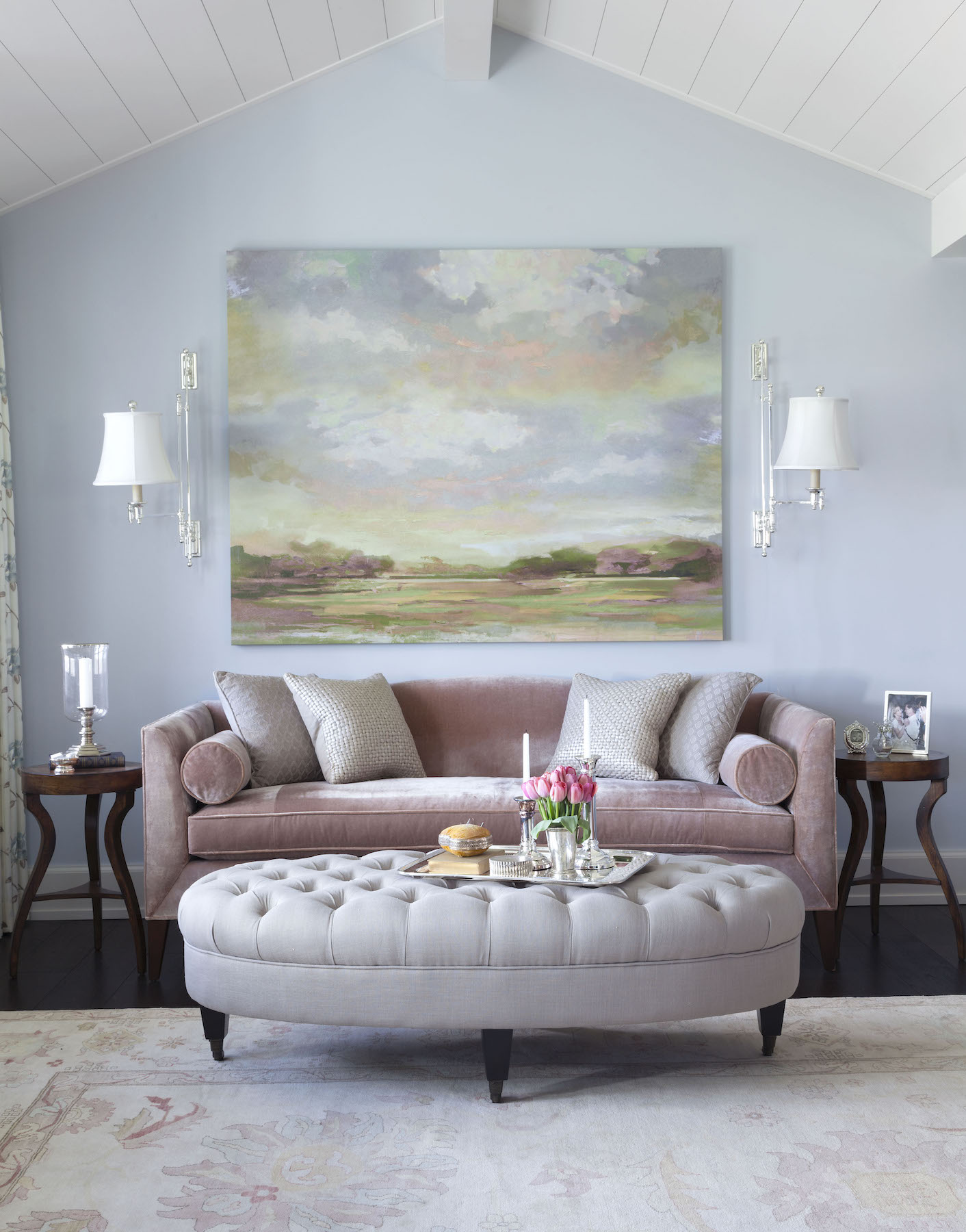
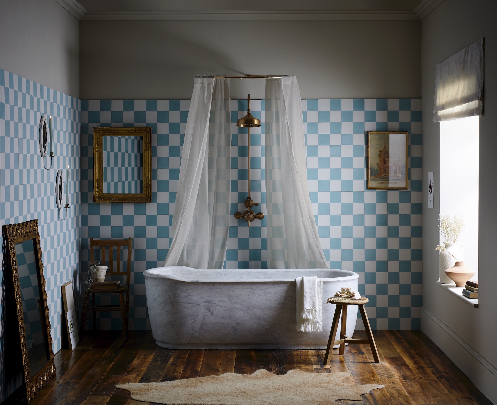
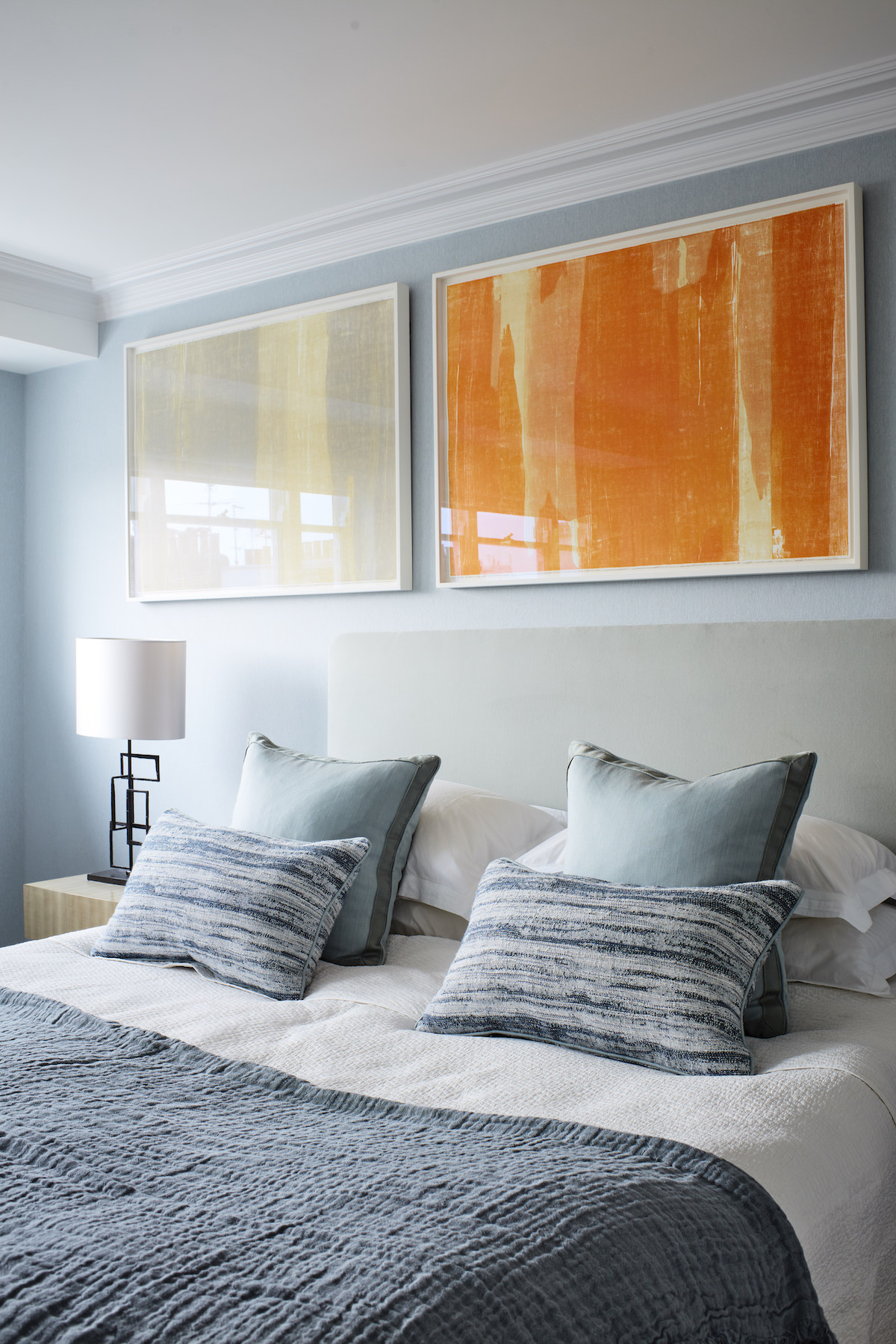
Often associated with youthfulness and innocence, there’s good reason why this delicate palette is often reserved for a children’s bedroom. Used correctly, however, and pastels can make for a sophisticated, stylish and timeless choice for any room in the house. “Pastels add vibrance without overwhelming the scheme and are ideal for creating a calm and serene atmosphere,” explains Wallers. “I think cooler blues and greens are tranquil and refreshing, making them perfect for bathrooms and kitchens, while warmer hues like pinks or lavenders are particularly popular in bedrooms, where they feel restful yet bright and welcoming.”
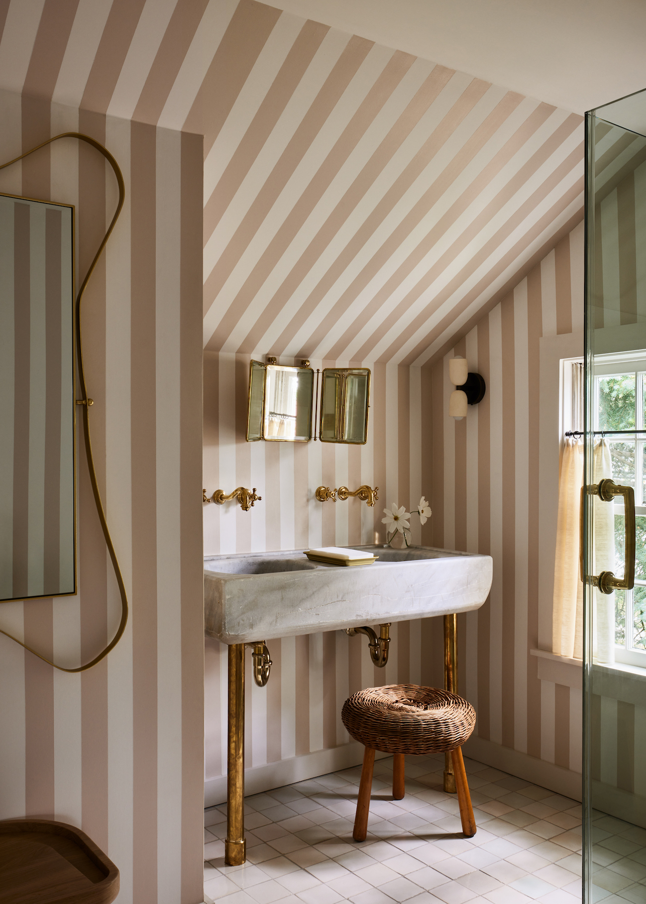
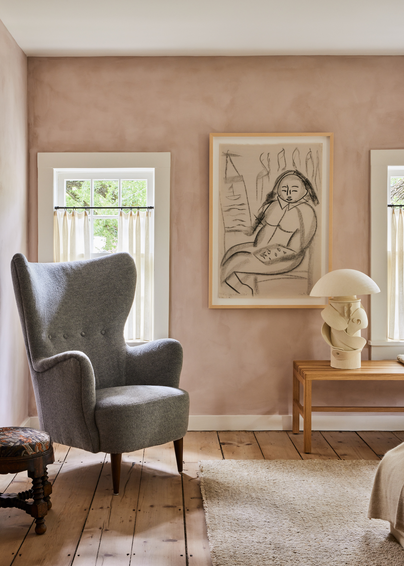
Kristin Fine, founder of interior design studio Fine Concepts and co-founder The 1818 Collective, is another advocate for soft blush hues in the bedroom, which is apparent in one particularly beautiful bedroom from the Collective, found in Sag Harbour New York. “I love dusty nudes and blush tones because I think people always feel good in them,” she says. “It is a hue that makes your skin glow and great to utilise in spaces where you want to feel pretty. I use a lot of dusty pale and nude stone in bathrooms, for example, which reflects beautifully, or perhaps it’s a morning room where you want to start your day feeling relaxed and soft.”
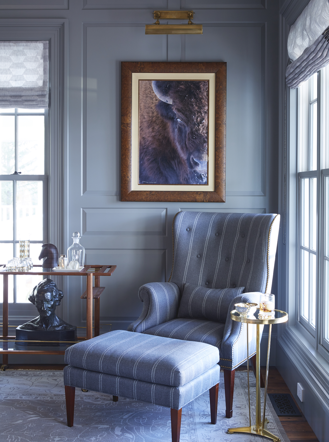
“We are big fans of pale blue at Lonni Paul, which combines perfectly with ivory and soft greens,” Paul counteracts. Proof is in the pudding throughout one of her recent projects – a large Montana ranch home which came with the instructions to create a soft and feminine space. “But not too feminine, because her husband lives there with her too!” she adds. “We went for a sophisticated approach to pastel, with varying tones of light blue. Then there were some spaces where we were able to really bring in hues of pink and blush, like in her dressing room and office. The client was thrilled with the result.”
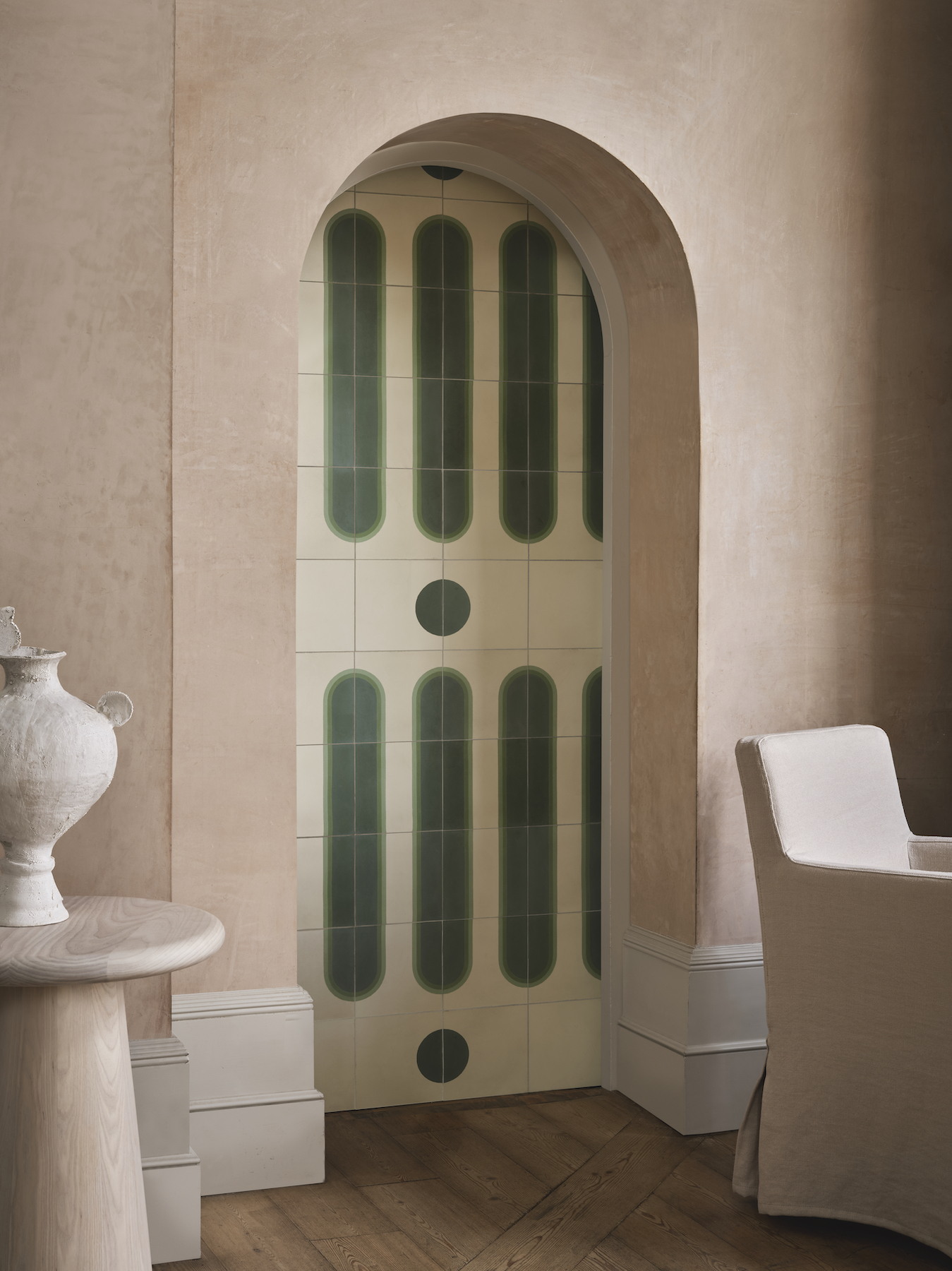
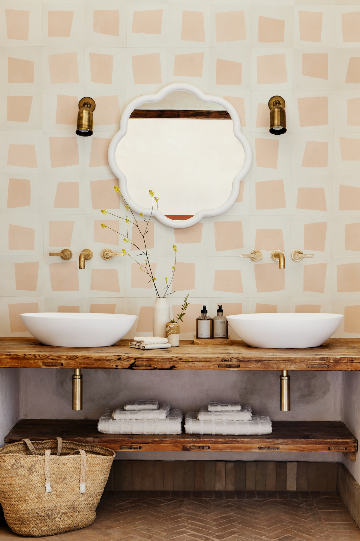
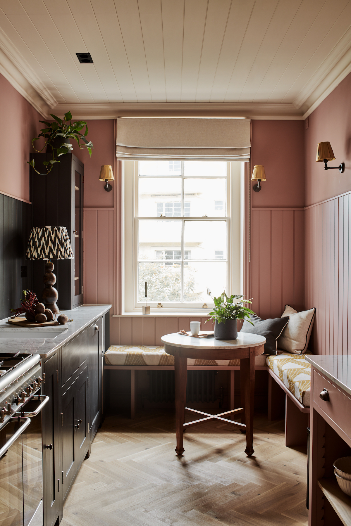
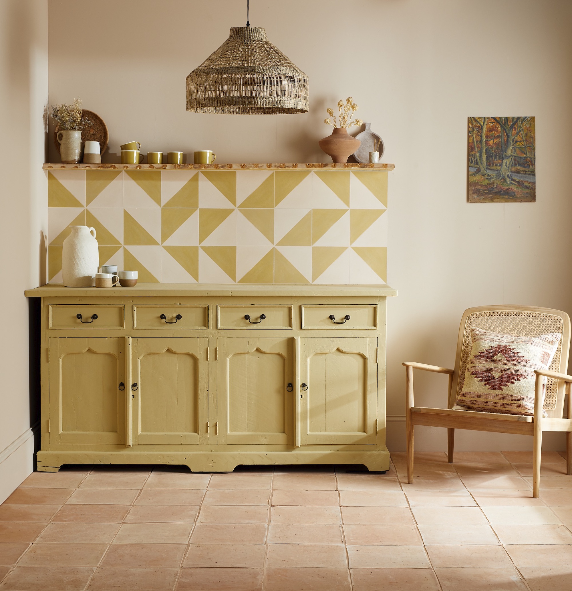
All three designers agree that contradiction and juxtaposition with colour palettes, materials and textures is the secret to avoiding a sickly-sweet space. Wallers, for example, recommends pairing a soft pastel with its darker and more dramatic counterpart in the same tone as an anchor – “a pastel blue wall looks great with deep blue sofa upholstery, for example” – while balancing pastel hues with stronger accents or neutrals can also stop the whole room from feeling overpowering. Fine, on the other hand, believes the palette works best in an earthy room, which are more adept at handling these softer hues. “It’s all about the juxtaposition, and we like to pair pastels with the likes of rough timber and old floorboards, or perhaps create a stripe in an unusually-spaced area,” she adds. Whether it’s opting for one statement hue or a marriage of complementary hues, pastels are guaranteed to brighten any room while creating a dynamic and layered look, creating a more cohesive look that doesn’t feel saturated in too much colour. “We don’t say ‘baby’ pink or ‘baby’ blue anymore,” concludes Paul. “2023’s pastels are in no way childlike. Just like a chic pale blue or pastel pink shirt from a luxury designer runway, they are sophisticated hues that can work for both men and women alike.”
Read more: Interior Designers I Interiors | Vintage | Design