


Interior designers and brands are predicting the biggest trends for 2024, and there’s one universally loved colour that’s promising to steal the limelight
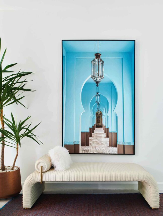
The last couple of months have unveiled a peek into the interior design trends set to dominate the year ahead, and there’s one particular colour that looks like it’s about to have a moment. A perennial favourite for modern homes, and a pivot from the pistachios and sages we saw dominate 2023, we can expect blue to emerge with a bold freshness, as multiple experts highlight its varying tones as their colours of the year for 2024.
We’re particularly all ears when it comes to Benjamin Moore’s annual trend forecasting, with the industry-leading paint company recently announcing Blue Nova 825, a mid-tone blue with warm violet undertones, as its leading colour. Then we have Thermal, a mid-tone blue reminiscent of crisp winter skies, named by C2; Skipping Stones, a cool, breezy blue that pairs well with warm whites, beiges and natural elements, from Dunn-Edwards; and Upward SW 6239, a brighter blue designed to infuse peacefulness into any space, by Sherwin-Williams, to name a few. So what exactly is it about this acclaimed hue that is causing such a stir?
“The trending of blue interiors in 2024 isn’t surprising when you consider the enduring appeal of blue in home decor,” Susie Atkinson, founder of the London-based Studio Atkinson tells Effect. “Blue offers the perfect blend of versatility and timelessness, as its wide spectrum can adapt to a range of design styles and moods in any home.”
Los Angeles-based interior designer Lonni Paul agrees, adding that blue “never goes out of style and can suit both traditional and modern aesthetics, whether used as an accent wall, incorporated through furniture or brought in through accessories.” Its adaptability, it seems, is key, as whether you choose the palest, sweetest blue for a light-filled kitchen or the darkest, inkiest navy for a living room, there are endless creative possibilities.
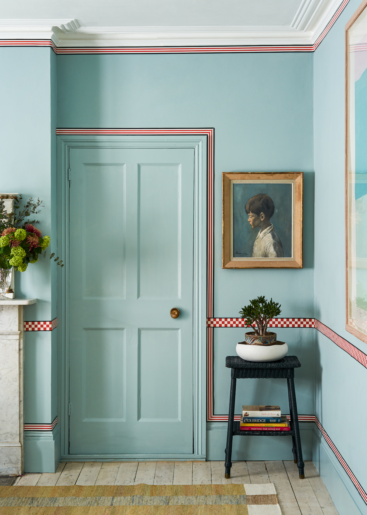
When it comes to choosing a shade of choice, there are myriad aspects to consider in the home, and the first is what ambience you are looking to achieve. Perhaps you are hoping to evoke an air of sophistication in a modern-day dining room, or maybe it’s a feeling of calm and serenity in a master bedroom. Whatever the appeal, all designers can agree that the versatility of blue is where its charm truly lies.
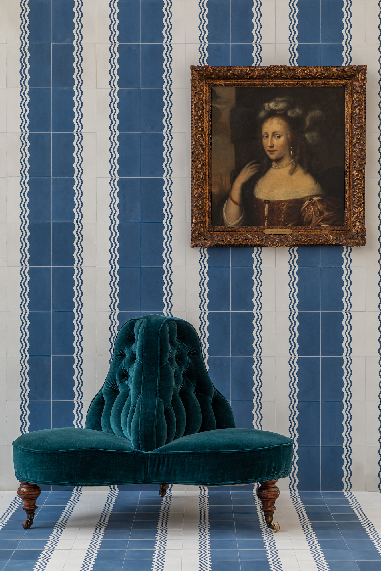
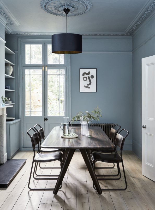
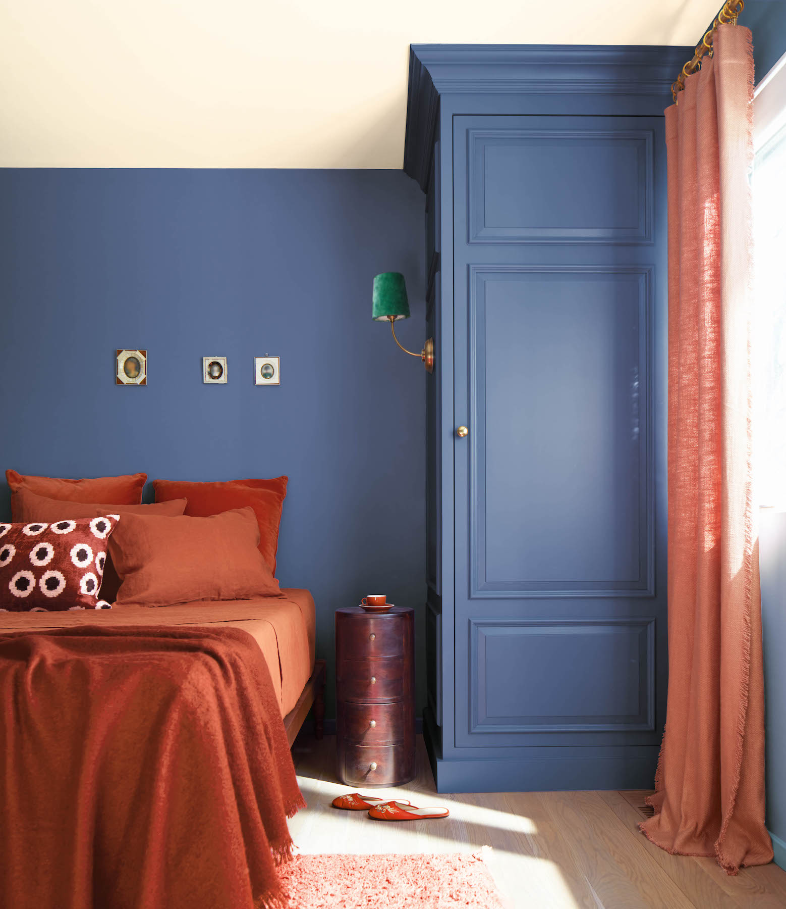
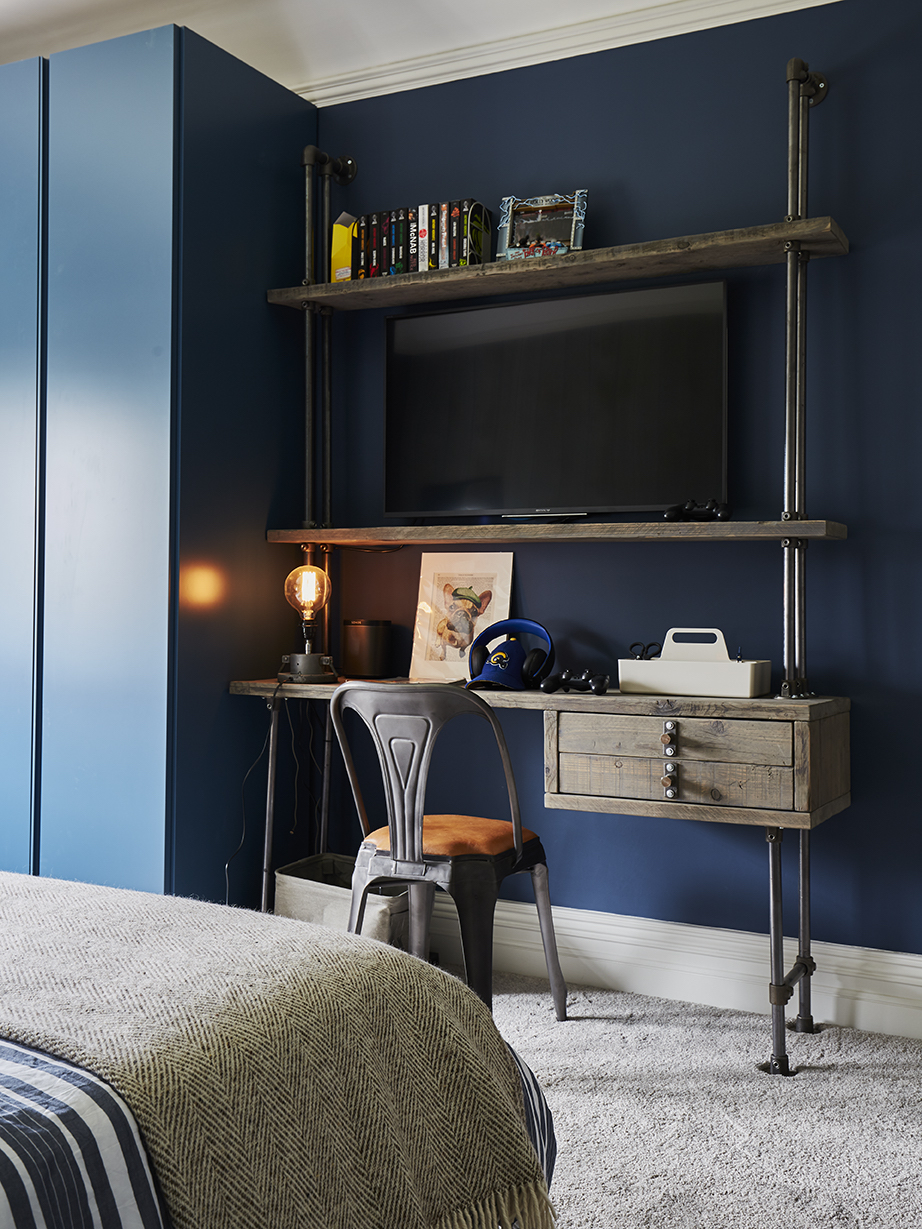
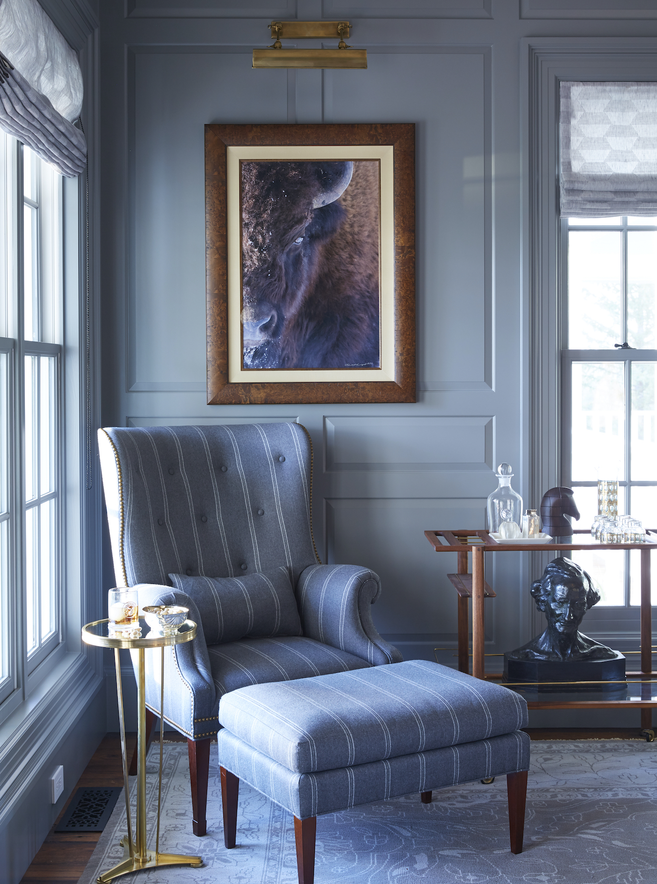
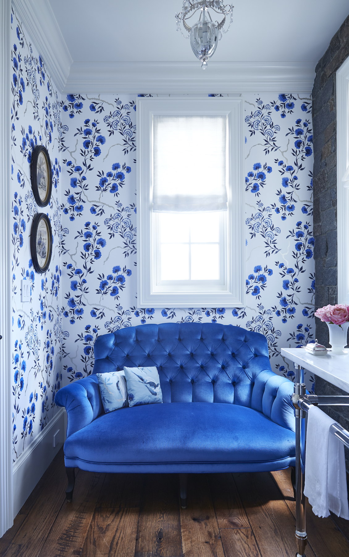
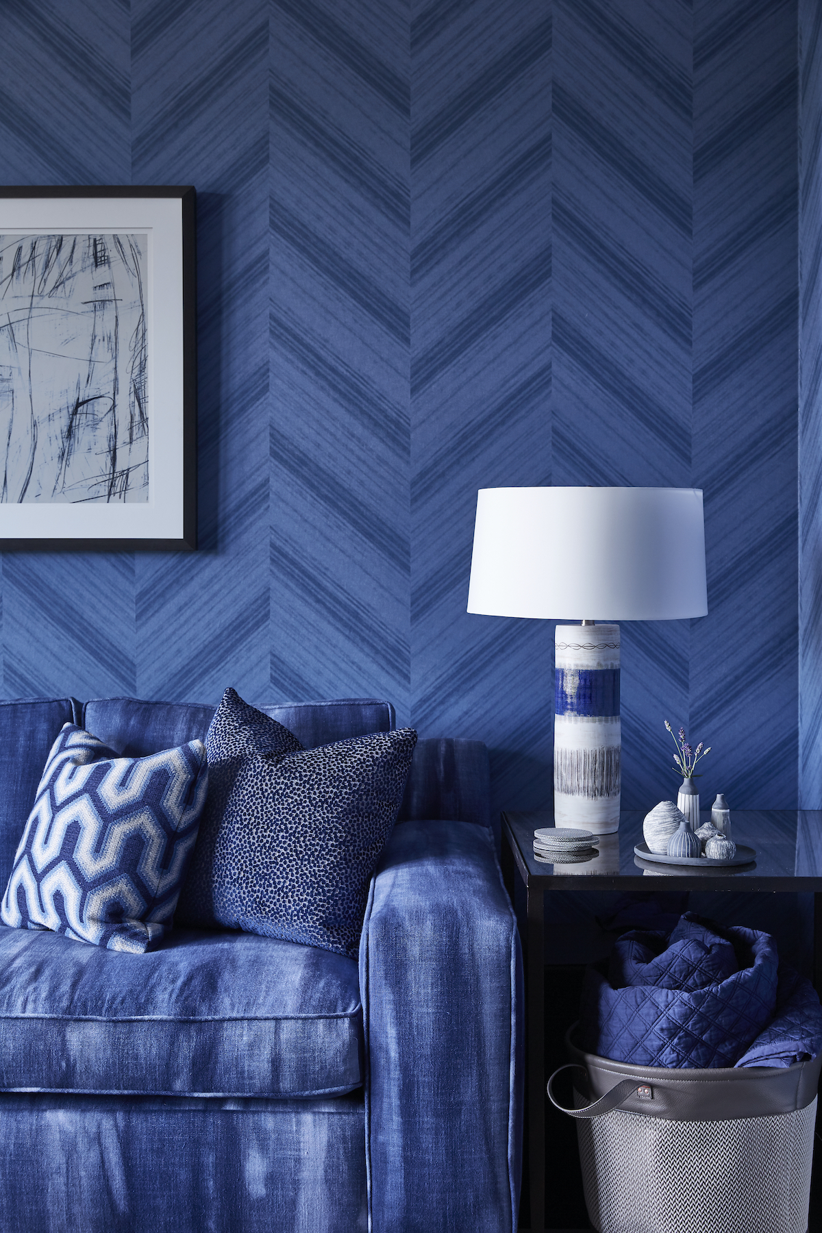
“It’s a truly interesting colour because, depending on what shade you use, blue can be used to cool down a space, or equally make it more warm and inviting,” says interior designer Cherie Lee, founder of Cherie Lee Interiors. “Light blues create an open and inviting atmosphere, and are often associated with period homes like those from the Georgian or Victorian eras. They also embody airiness and a connection to nature. Dark blues and navies, on the other hand, lend a more modern appeal and are more easily paired with other colours. They tend to create more cosy and atmospheric vibes in a room.”
Depending on what shade you use, blue can be used to cool down a space, or equally make it more warm and inviting.
Cherie Lee, founder of Cherie Lee Interiors
Evident in the living room of the studio’s Grade II listed Queen Anne project, Lee and the team opted for a palette of deep greys and blues to create a cohesive colour scheme throughout. “In the living room, a focus on comfort led us to embrace the smaller proportions of the room, painting the walls and the joinery a deep blue to cultivate a sophisticated yet snug and cozy atmosphere,” she adds.
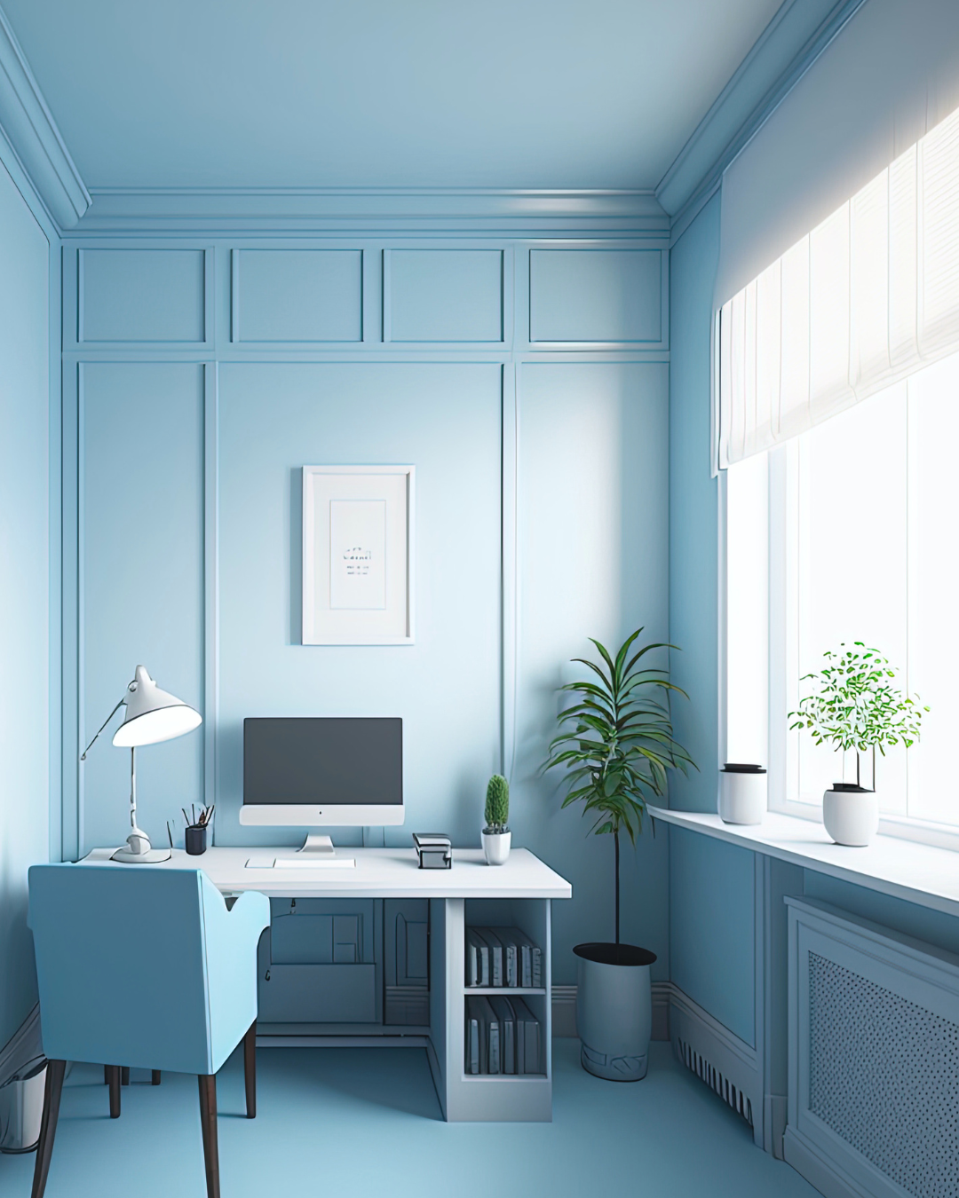
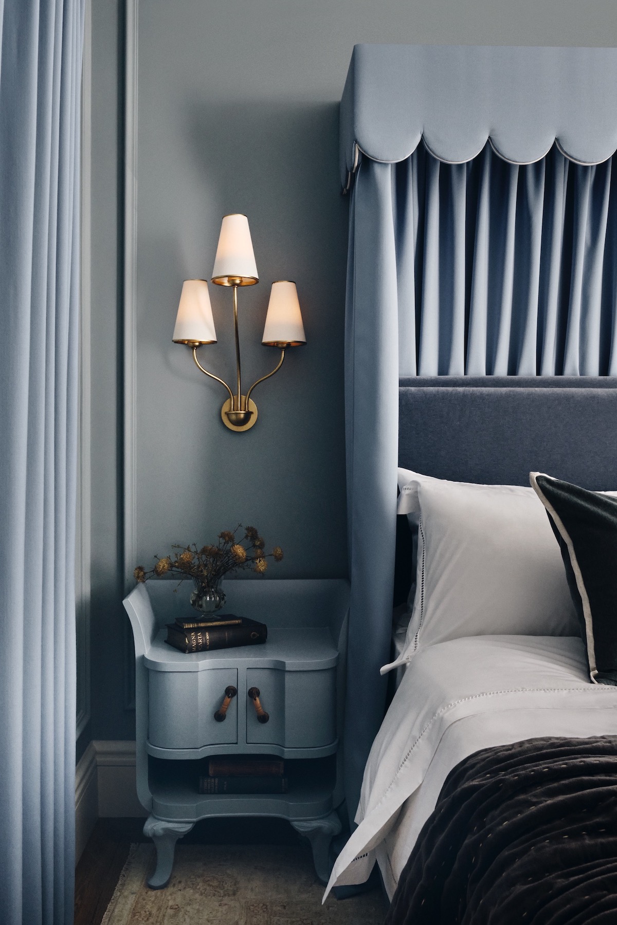
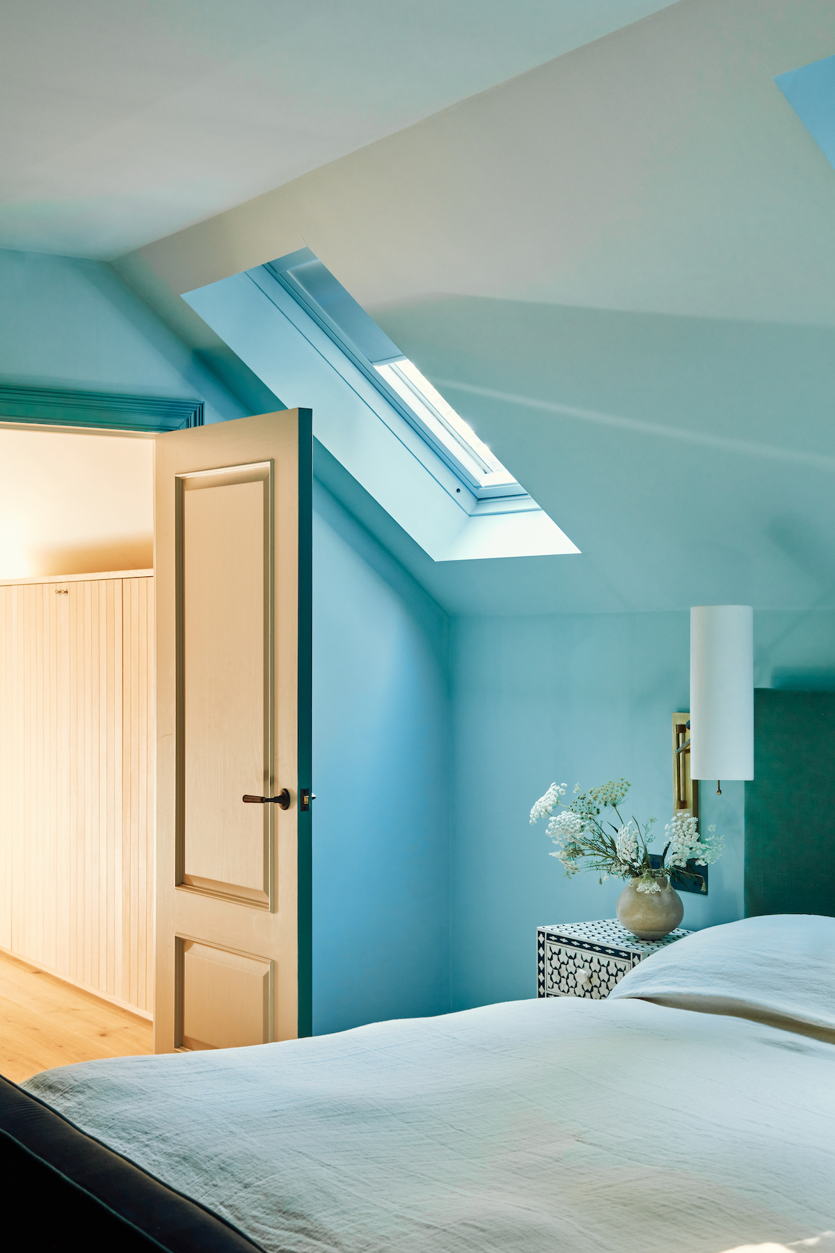
On the other end of the spectrum, the soothing effect of a light blue hue can be seen in the bedroom of a characterful family home in Hertfordshire, where Somya Singh of London-based multidisciplinary design studio TO&FROM put a great emphasis on colour and nature to enhance the outdoor-indoor connection and celebrate the beauty of the surroundings. “Colour played a crucial role in defining and complementing the purpose of each space,” Singh tells Effect. “We began by translating the hues of the sky onto the walls with soothing blue paint then, to ground the space, a deeper contrasting shade of blue was carefully chosen for the skirting, architrave and joinery.”
Using a combination of Blue Gum by Paint & Paper Library for joinery and skirting, and Bone China Blue by Little Greene for walls and ceiling – both of which have a warm grey hue to them which added an earthy quality to the space – she was able to instil a sense of tranquillity and calm while introducing a touch of understated luxury and richness. “Our goal was to create a cosy retreat – a place to unwind and escape the demands of the day. Yet it’s more than just a retreat; it’s a blend of richness and depth, carefully woven into the essence of relaxation and indulgence,” she adds.
The size of the room is another important consideration when adopting a suitable shade of blue, with Atkinson advising light blue can be particularly effective in smaller rooms to visually expand the space and make it feel larger and more inviting. As is lighting, which can have an important overall effect on how the paint is perceived. “Natural light brings out the truest form of colour while artificial light can shift its appearance, so be sure to check your colour in the room before going full steam ahead,” advises Paul. “Lighting from a lamp, chandelier or other fixture can add contrast or enhance the overall colour scheme. Opt for softer lighting for a cosy ambiance while, for a vibrant, energetic feel, more intense, direct lighting would be appropriate.”
The trending of blue interiors in 2024 isn’t surprising when you consider the enduring appeal of blue in home décor.
Susie Atkinson, founder of Studio Atkinson
For designers erring on the side of caution, the use of blue through furniture, appliances and textiles is a popular way to nod to the trend without having to commit to overhauling an entire room. Sofas and chairs upholstered in a sumptuous deep navy velvet or royal shade of blue, for example, can create a striking visual point, particularly when set against neutral walls, while soft azure linens promote a calming effect making them great for bedrooms or coastal homes.
Elsewhere in the home, blue cabinets in the kitchen or bathroom can provide a bold and timeless look that seamlessly merges with any design style. “It’s important to keep the finish in mind when selecting furniture and appliances,” advises Paul. “The finish will affect how bold or calm the colour is perceived, with glossy surfaces reflecting light to make the colour seem brighter, while matte finishes have an absorbing effect for a darker result. More and more brands are offering a wider range of colours which can bring a playful touch to any kitchen.” It’s clear that the enduring popularity of blue in interior design transcends mere trendiness, revealing a profound connection between colour and emotion. Whether used as an accent or a dominant force, its allure is set to persist well into the new year, imparting a sense of tranquillity, depth, and timeless elegance to every home it graces.
Read more: Interiors | Trends | Living Rooms | Dining Rooms | Bathrooms | Sustainable Design | Design